Create labels that attract and convert. Get expert product label design tips from Jisha Label for better packaging results.
Introduction:
In today’s competitive marketplace, your packaging is often the first interaction a customer has with your brand. Before they read about features or compare prices, they see your label. That’s why product label design plays a powerful role in influencing buying decisions.
A well-designed label does more than look attractive – it communicates value, builds trust, and encourages customers to choose your product over competitors. Whether you are a startup, manufacturer, or growing brand, understanding how to use colors, fonts, and layout strategically can directly impact your sales.
In this guide, we’ll explore practical and proven label design tips to help you create packaging that not only looks good – but actually sells.
Why Product Label Design Matters More Than Ever
Modern customers make fast decisions. Studies show that visual appeal significantly influences purchasing behavior. When a product sits on a shelf (physical or digital), your label must:
- Grab attention
- Communicate key information clearly
- Reflect brand identity
- Build credibility
Strong packaging label design builds brand recognition and customer loyalty. Poor design, on the other hand, can make even a high-quality product look unprofessional.
At Jisha Label, we’ve seen how thoughtful design choices can transform packaging from ordinary to impactful.
The Psychology of Colors in Label Design
Color is not just decoration – it triggers emotion.
Different colors create different perceptions:
- Red – Energy, urgency, excitement
- Blue – Trust, reliability, professionalism
- Green – Natural, organic, eco-friendly
- Black – Premium, luxury, sophistication
- Yellow/Orange – Optimism, warmth, attention-grabbing
How to Choose the Right Color
When working on your product label design:
- Match colors with your product category
- Consider your target audience
- Ensure readability (high contrast between background and text)
- Stay consistent with your brand identity
For example, a health product may benefit from clean greens and whites, while a luxury cosmetic brand may use black and gold.
Pro Tip:
Avoid using too many colors. A cluttered color palette reduces clarity and weakens brand recall.
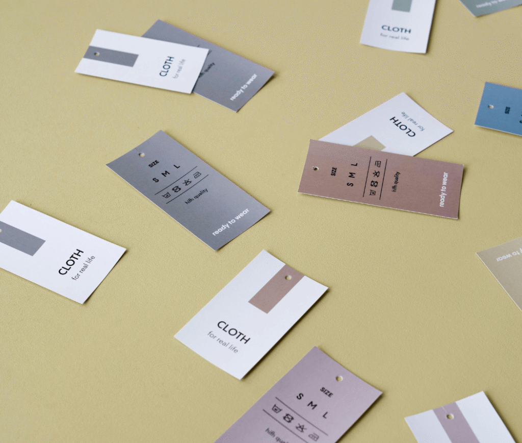
Choosing Fonts That Enhance Readability
Typography plays a major role in how your message is received. The wrong font can confuse customers, while the right one builds trust.
Key Rules for Font Selection:
- Keep it readable
- Avoid overly decorative fonts for essential information
- Maintain proper font size hierarchy
- Use no more than two or three font styles
Font Types and Their Impact:
- Serif Fonts – Traditional, trustworthy
- Sans-Serif Fonts – Modern, clean, minimal
- Script Fonts – Elegant, but use sparingly
When designing packaging labels, clarity should always come before creativity. Customers must easily read product names, ingredients, instructions, and expiry dates.
At Jisha Label, we always recommend balancing creativity with functionality to ensure compliance and visual appeal.
Smart Layout: The Secret to Visual Balance
Even with the perfect colors and fonts, poor layout can ruin your label.
Layout refers to how elements are arranged on your packaging-including logo placement, product name, barcode, and mandatory information.
Elements of a Strong Label Layout:
- Clear visual hierarchy
- Enough white space
- Proper alignment
- Balanced spacing
Create a Visual Flow
Your customer’s eyes should move naturally:
- Brand Name
- Product Name
- Key Benefits
- Supporting Information
Overcrowded labels confuse buyers and reduce shelf impact. Clean design increases perceived value.
Prioritizing Essential Information
An effective product packaging design combines creativity with compliance. While branding is important, you must also include:
- Ingredients
- Usage instructions
- Safety warnings
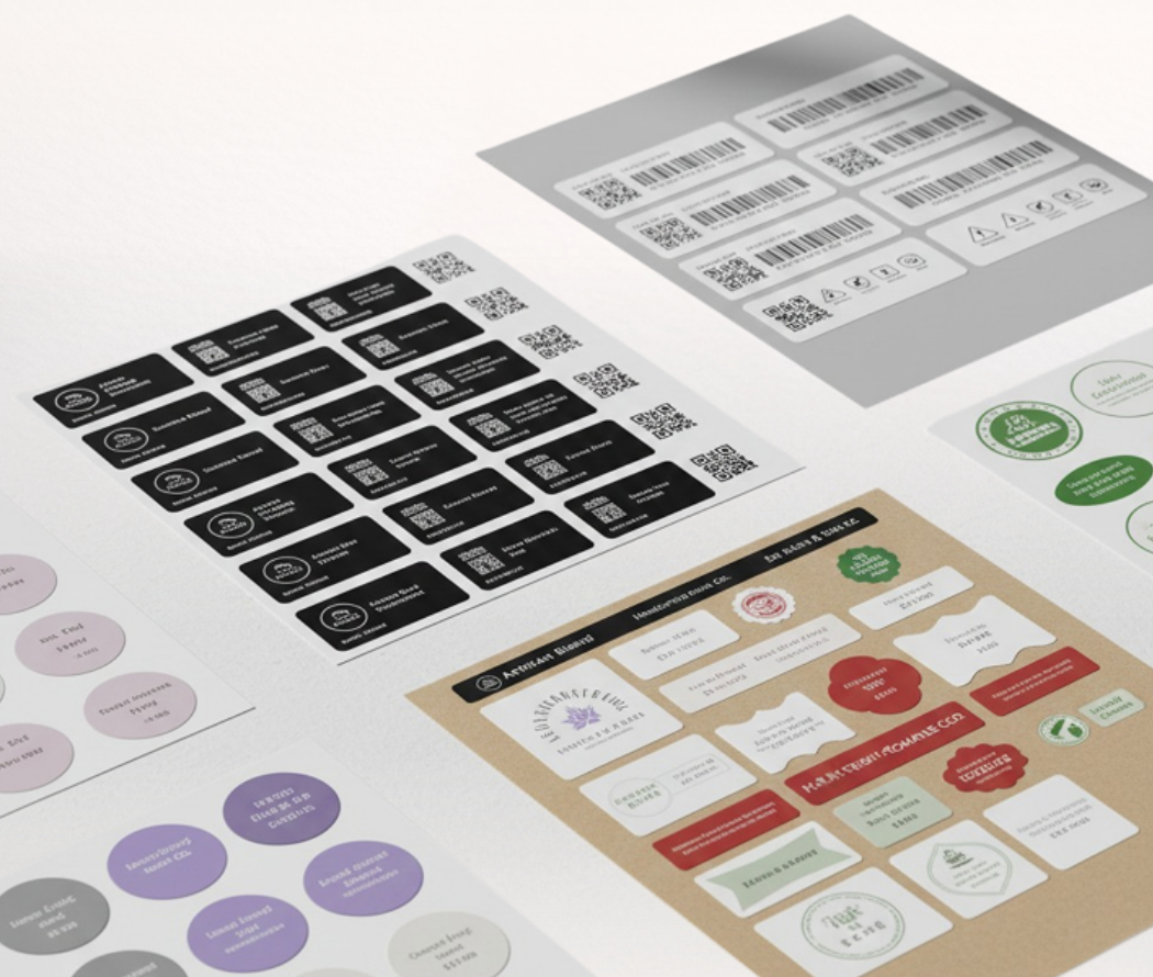
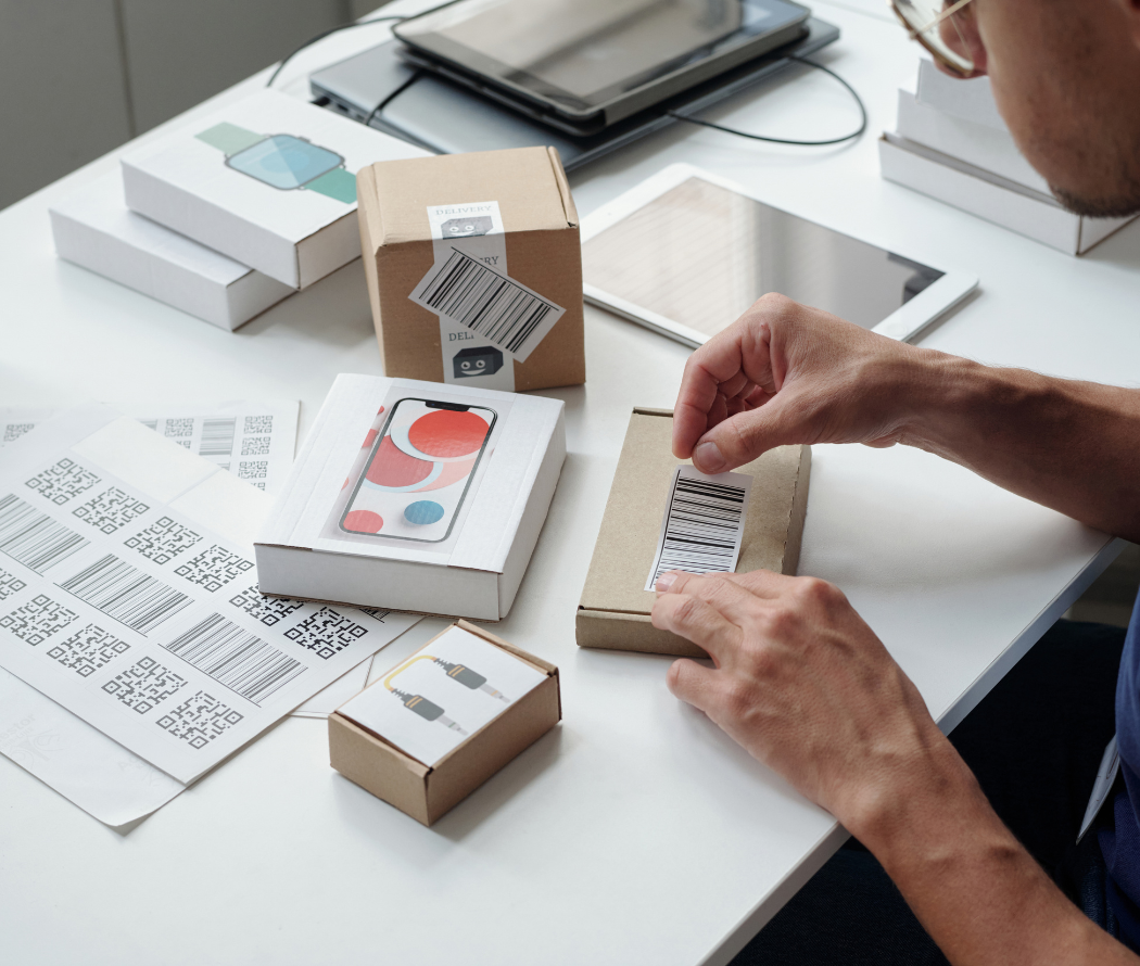
- Barcode
- Manufacturing details
Make sure mandatory details are visible but not overpowering the design. Smart layout planning ensures regulatory compliance without sacrificing aesthetics.
Creating Shelf Impact
Imagine your product sitting next to 20 competitors. What makes it stand out?
To create strong shelf presence:
- Use contrast strategically
- Highlight unique selling points
- Keep branding consistent
- Avoid copying competitor designs
A strong product label design differentiates your brand while maintaining professionalism.
Understanding Your Target Audience
Label design should speak directly to your ideal customer.
Ask yourself:
- Is your product premium or budget-friendly?
- Is your audience young or mature?
- Is your brand modern or traditional?
For example:
- Minimalist designs attract modern consumers
- Bold, vibrant packaging works for youth-focused products
- Clean and neutral designs appeal to health-conscious buyers
Understanding audience psychology makes your packaging more persuasive.
Consistency Builds Brand Trust
Brand recognition happens through repetition and consistency.
Keep consistent:
- Logo placement
- Color scheme
- Font style
- Design structure
When customers see your product again, familiarity increases trust. This is especially important for small businesses trying to grow brand loyalty.
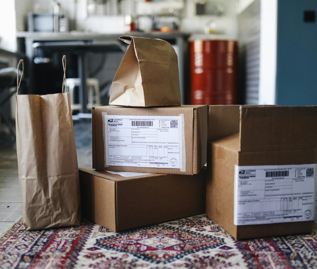
Professional printing quality also plays a key role. Faded or peeling labels damage credibility instantly.
That’s why at Jisha Label, we emphasize both strong design and durable printing materials – ensuring your labels look premium throughout the product lifecycle.
Balancing Creativity with Compliance
Many brands focus only on aesthetics and forget compliance requirements. Depending on your product category, you may need to follow specific packaging regulations.
Good label design:
- Meets legal standards
- Maintains readability
- Keeps barcode scan-friendly
- Uses durable materials
Compliance should never disrupt your visual identity – it should be integrated smoothly into the layout.
Testing Before Mass Production
Before printing thousands of labels, always test:
- Color accuracy
- Print clarity
- Adhesive strength
- Barcode scanning
- Durability under different conditions
Testing protects your investment and ensures your product label design performs in real-world environments.
At Jisha Label, we recommend sample testing before final production to avoid costly mistakes.
Why Professional Label Printing Matters
Even the best design can fail with poor print quality.
High-quality printing ensures:
- Sharp colors
- Clear text
- Long-lasting durability
- Professional finish
When customers hold your product, the tactile and visual quality of the label influences their perception of value.
Investing in professional labeling solutions supports long-term brand growth.
Conclusion
Designing labels that sell is both an art and a science. A strong product label design combines:
- Strategic color psychology
- Clear typography
- Smart layout structure
- Compliance awareness
- High-quality printing
Your packaging should communicate trust, professionalism, and value – all within seconds.
Whether you are launching a new product or refreshing your brand identity, thoughtful design decisions can significantly improve your market performance.
At Jisha Label, we help businesses turn creative ideas into impactful, high-quality labels that enhance packaging and support brand growth.
If you want your packaging to stand out, start by improving your label – because great products deserve labels that truly sell.
FAQ
Why is product label design important?
A good label grabs attention, builds trust, and helps increase product sales.
How do colors affect packaging?
Colors create emotions and influence how customers see your brand.
What fonts are best for product labels?
Simple, clear fonts that are easy to read work best on labels.
Why does label layout matter?
A clean layout makes information easy to understand and improves shelf appeal.
How does Jisha Label support businesses?
Jisha Label provides high-quality, durable label printing that enhances product packaging and brand image.